I like making pretty pictures.
In every good architecture presentation (specifically in an academic setting) there are a few key drawings that help communicate the design of a building/landscape/object/whatever. Site plans, floor plans, sections, elevations, axonometric drawings and diagrams all help to communicate what the building looks like and why it looks like that. But architecture is much more than just looks. Architecture also feels a certain way.
With all of that said, my favorite part of the architecture design process is creating renderings that express how a building should feel. So, I’ve decided to use examples from my summer studio to share three different renderings of (essentially) the same building done in three different styles.
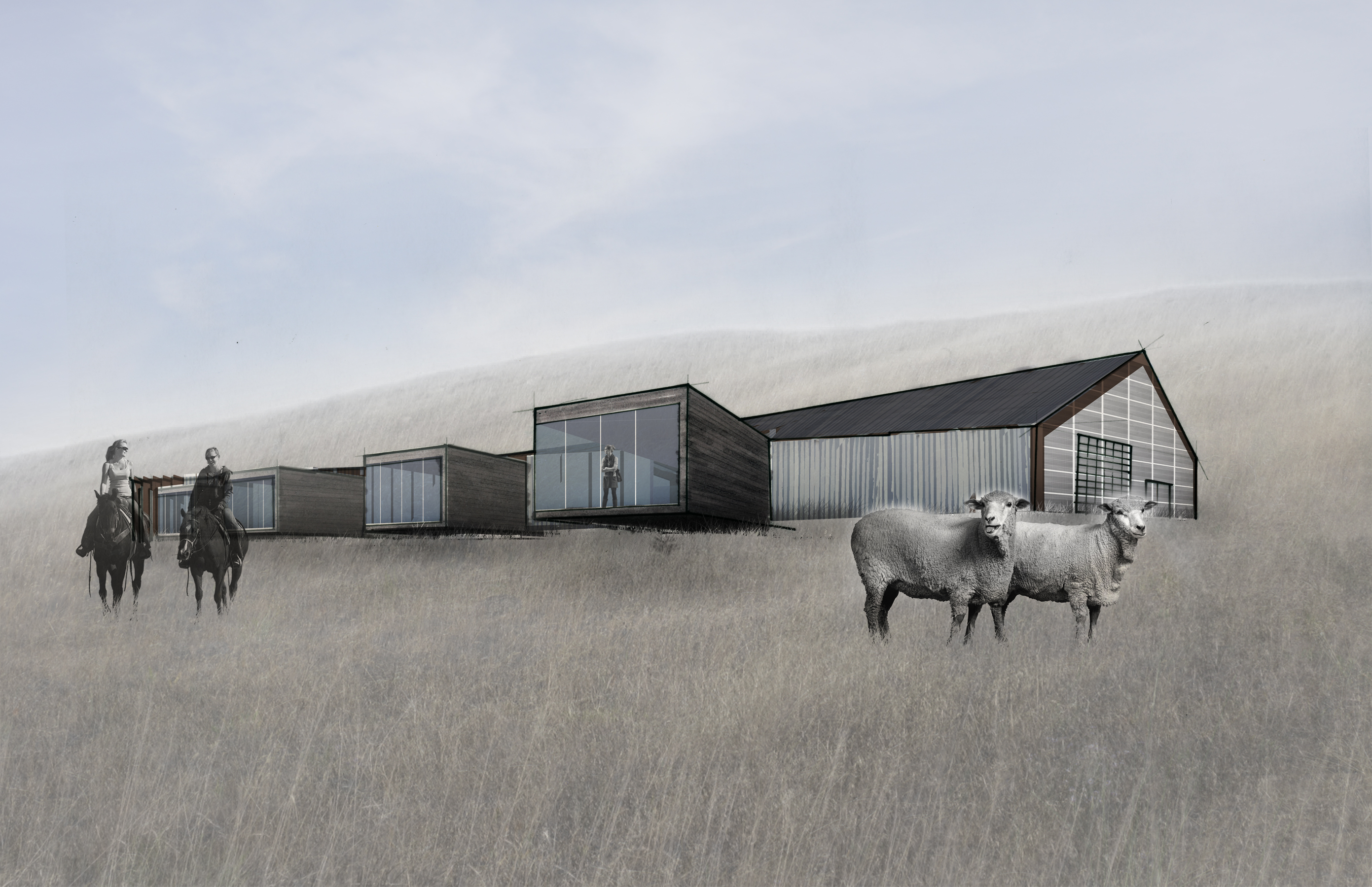
This first rendering was made for the studio midterm. It is left purposefully abstract because… well… I didn’t know much about the building yet! It is essentially a Sketchup massing model with some light overdrawing and material overlay. Some things are strategically detailed while others are strategically covered by women on horseback or sheep in the pasture. At this point in the design process, the important thing to show was how the building sat in the landscape and the major design moves I was making (a long gabled structure intersected by projecting volumes).
If you think that is abstract, then hang on…
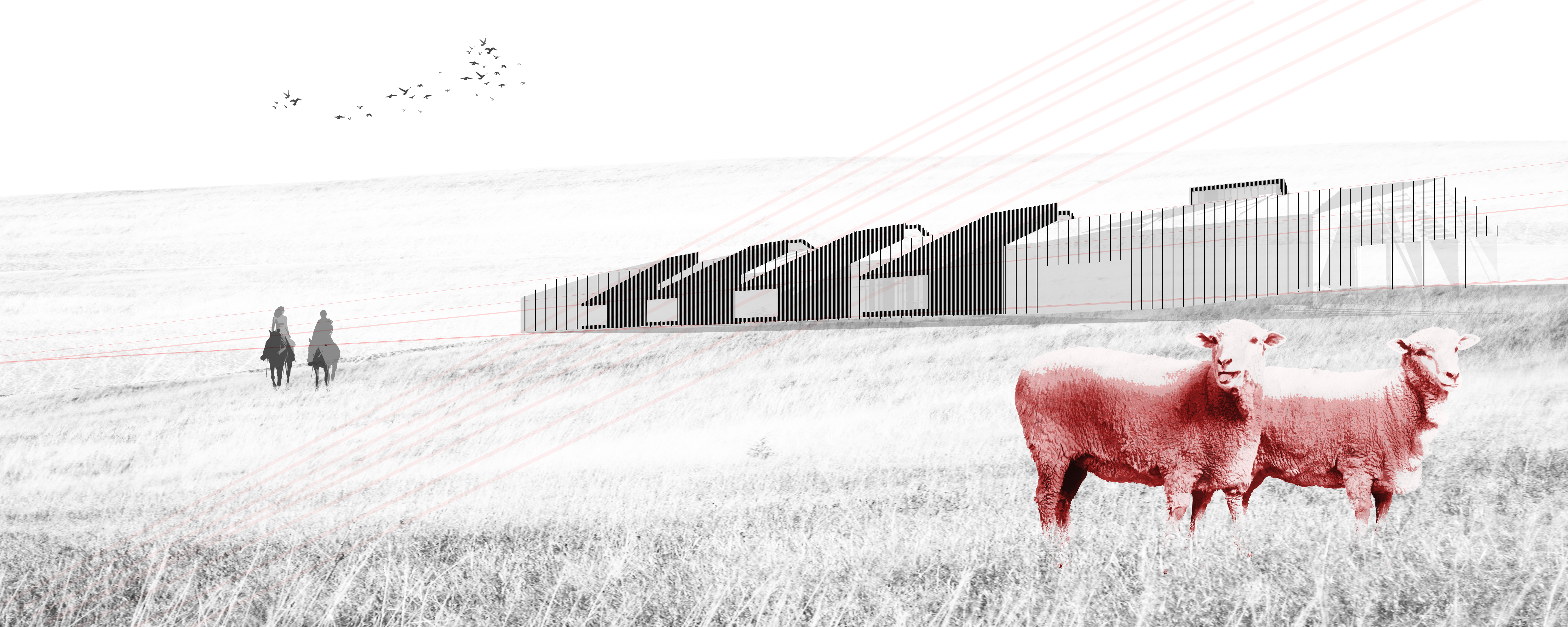
I am a HUGE fan of very abstract renderings, though I will admit I am no where near a master. There is a very fine balance between what should be illustrated and what should be left out that I find very difficult to manage. This illustration is again attempting to show the major design decisions I’ve made while leaving out any design details I have yet to consider. Someday I would love to do an extremely abstract, collage-like rendering and proudly pin it up for my final presentation… but that didn’t happen this summer…
Instead, I went with my go-to rendering style:
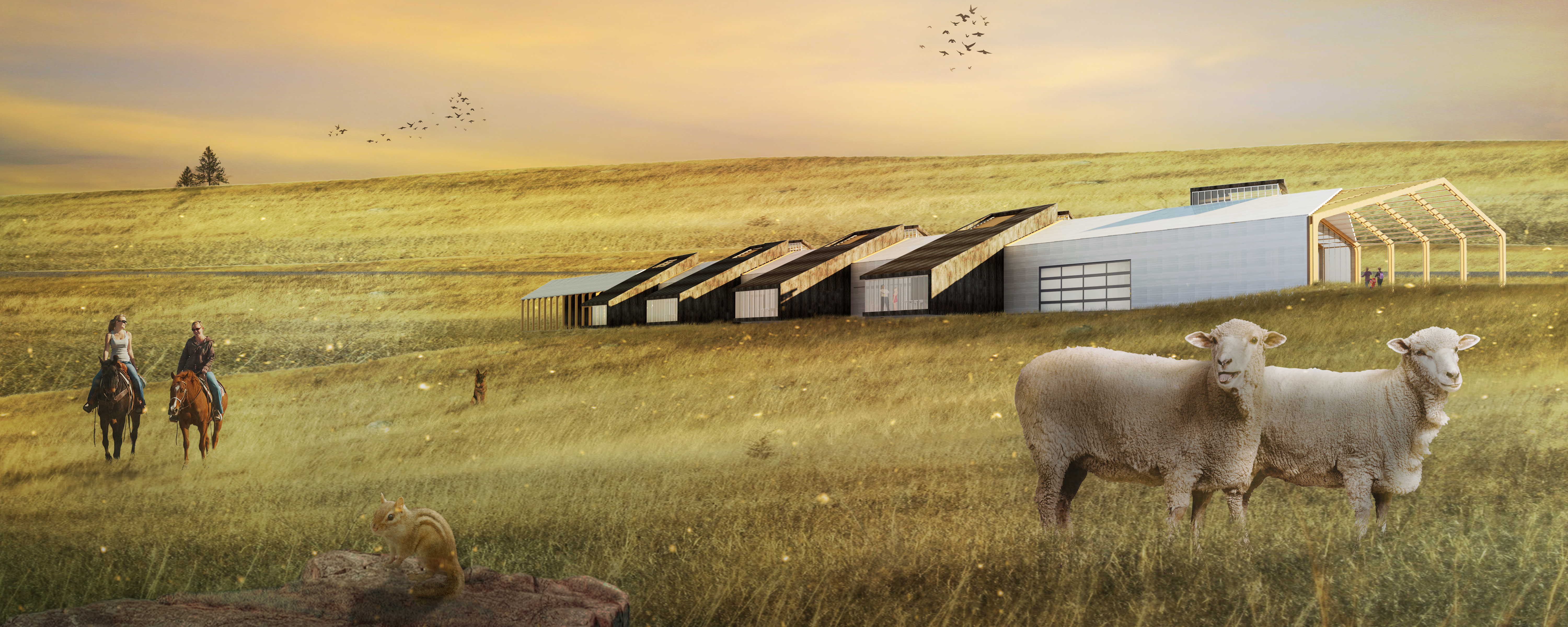
The above image has become a pretty typical rendering style for me: a basic Revit rendering for the building followed by a fairly intensive layer of Photoshop love.
My portfolio is now filled with renderings that look like this, which receives mixed reviews. Some say, “Wow! Look at that chipmunk!” Others exclaim, “Ooh! Nice! That is the kind of meadow I want to be in! It just looks like it feels nice!” Some even say, “That looks pretty goofy…”
The point is, it doesn’t matter really what the image looks like. There are a dozen ways to represent the same project, and everyone will like a different style. What matters is what the image is communicating.
In this case: This wool production facility is the most heavenly most over-rendered place on earth. If you are good, when you die you will go here.


Leave a comment